Helion
Helion gives your site a unique look and feel by putting a large focus on the left and right column positions. It was designed for movie sites but can easily adapt to other contents. Helion has no shortage of features, it is packed with more features than other Shape5 template to date! Some features include a light or dark style option, four custom highlight colors, enabling or disabling the floating header, multiple logo position options, social icon integration and much more!
|

|
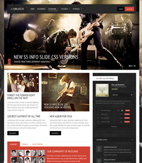
Emusica
If you are looking to revamp your band's website or start a social music community Emusica is the design for you! The beautiful design is packed with features! We introduce our NEW MP3 HTML5 Gallery Module, S5 Image Scoller version 2 which is now responsive and a NEW full width menu option for the s5 flex menu. In addition to these features we've updated the info slide portion of Vertex to now include a CSS only version. The new CSS version has several new display styles available!
|
<
|
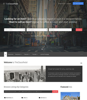
The Classifieds
The Classifieds Ads template is your perfect choice for creating an online listings directory. The directory is powered by the Joomanager component purchased separately. The directory offers features including, ratings, paid ads, Google map search and unlimited searchable custom fields and much more! Although the template is geared for a directory style site keep in mind it can be used for any website. Check out the "Joomla frontpage" menu item to see the demo of this.
|

|
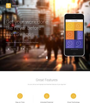
Swapps
App designer looking for a template for your new App? Swapps is a clean, sophisticated yet simple responsive Joomla template designed to display your App in elegance. This template includes a new circle table section perfect for calling out specific features of your App. We also have released a new MailChimp newsletter module. With this module your users can easily get on your mailing list for updates and news. |

|
Photobox
Photobox is a flat style template specifically designed for photographers or other artists to use as a portfolio style site. It has many great features to easily showcase one's artistic talents. There are many great built in features such as full color control, custom highlight fonts, multiple logo locations, optional lowercase letters, and much more!
|

|
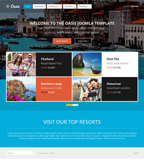
Oasis
Oasis is the ultimate flat style template! It comes loaded with many color options for changing the module row colors, titles, buttons and more. There are nine custom color options in total, plus the default Background controls of Vertex; all which give you the ultimate style control! Some other features include: a full width S5 Image and Content Fader, an opaque and overlapping header, enable or disable uppercase letters, new info slide styles, and much much more!
|

|
Number 1 Shopping
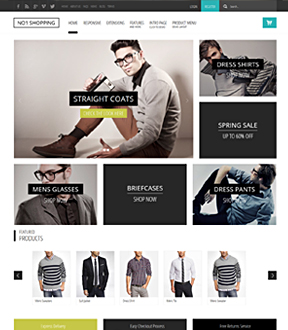
Number 1 Shopping is the design for you! The design is packed with features ready for any eCommerce website. The full width menu is great for extension categories you may need to list. The cart button is conveniently located in the top right and is included in the floating menu option too for easy of use. We've updated the VirtueMart 3rd party stylings to a more flat look. And the design itself is clean and clutter free so your products will take the focus on your site. If you have a color that fits your brand you can match by easily changing the 2 highlight colors in the Vertex admin area.y)Joomla 2.5 only
|

|
Corpway
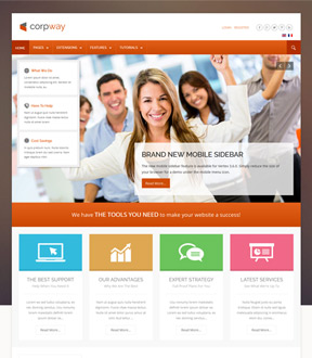
Corpway is the best template for any business or corporation! Easily match your company's color scheme by setting your own custom highlight color, which will change buttons, menu items, titles and more to any color you wish! This month we have also introduced sample pages such as: About Us, Our Services, Sample Blog, and more; to make site setup quick and easy!
|

|
Blue Group
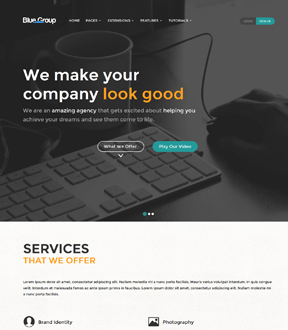
Blue Group is the perfect clean modern design for you. We've packed this template with modules including our new S5 Contact Popup module. This module is a great way for your visitors to easily get in contact with you and its powered by reCaptcha. We've also added on a Team and Portfolio page.
|

|
|
- Responsive
- Responsive Hide Classes
- Off Canvas Menu or Mobile Drop Down Items
- Google Fonts
- Font Awesome
- Font Resizer
- RTL Support
- Fixed Tabs - Side tabs for linking and popups
- CSS/JS Compression - Increase speed and performance
- Parallax Backgrounds - Background image scrolling effect
- Easily hide article area on any page
- Floating Menu - Set the flex menu to a fixed position
- Drop down tab with 6 positions
- JavaScripts - Tooltips
- JavaScripts - Lazy Load
- JavaScripts - Multibox
- JavaScripts - Info Slide
- JavaScripts - Scroll Reveal
- JavaScripts - Column Equalizer
- Fixed pixels or Fluid percent of screen width
- Average of 90 module positions
- Custom module widths, 60/40, 30/30/40, etc
- SEO optimized layout
- Upgradable Framework
- Lightweight and fast loading
- CSS3 and HTML5
- Flex Menu - Unlimited Menu Items
- Flex Menu - Change opacity, open delay, hide delay and effect
- Flex Menu - Includes 40 positions, publish modules to menu items!
- Flex Menu - Add subtext to each menu item
- Floating Menu - Set the flex menu to a fixed position
- Theme Specific Options - Easily add your own
- Max body width
- Custom column, page and row widths
- Menu Scroll To
- 100% tableless CSS
|
Below is the layout for all the templates above.
Each row or column will be visible only if you publish in at least 1 position in that row or column.
1. 2 positions on a row will be each 50% wide. 4 positions are each 25% wide, etc. The widths are user adjustable, for example 2 on a row can be 30% and 70%.
2. No positions published on a row means the row collapses and is not used. Columns work the same way. The published positions expand to fill in and make an even border all the way around the web site.
3. The yellow and blue areas are the most commonly used. That includes the article area and some top and bottom rows. You should start with those.The other areas are optional and do not appear if not used.

|


